01 / Position
Can someone tell what you do?
The first screen should name the kind of work, the audience, and the next useful action without hiding the answer inside a slogan.
A look at the decisions behind a useful website: what a first screen needs to say, how service pages earn their place, and how an inquiry gets from the site to the team.
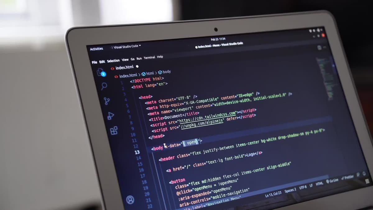
The visual studies on this page show directions, interactions, and layout decisions from the Down South Systems site system. They are demonstrations, not a list of named client projects. We are not presenting an illustrative screen as a customer result, and we are not attaching a review or performance claim to it.
That distinction matters. A portfolio page should make it easy to understand what was actually done, for whom, and what changed. When permissioned client work and verified outcomes are ready to share, a case study can add those facts. Until then, the useful thing to show is the work itself: structure, hierarchy, wording, and the path a customer can follow.

01 / Position
The first screen should name the kind of work, the audience, and the next useful action without hiding the answer inside a slogan.
02 / Relevance
A service page should explain the job, the relevant boundaries, what to prepare, and how to start—not just repeat the home page.
03 / Friction
Phone links, short forms, readable type, and a clear expectation about follow-up matter more than decorative motion.
04 / Continuity
Services, hours, photos, and contact details change. The site needs an owner, a maintenance path, and a scope that says what happens next.
A visitor should understand the service, the actual service area, and the kind of response they can expect. We use confirmed business details, not generic claims about every city or every type of job.
Presence includes a contact form that notifies the owner’s phone. The site can ask for the details the team actually needs to respond without turning the first message into an unnecessary application.
Complete System can add inquiry replies, booking, missed-call text-back, review requests, and CRM. Those are operational features, not a substitute for a clear site, and communication usage costs extra.
We can verify the published pages, links, forms, and agreed handoffs. Search visibility, inquiries, booked work, and revenue require ongoing measurement and are not invented as portfolio numbers.
When real client work is ready to publish, it should be more useful than a gallery of logos. A responsible case study names the client only with permission, identifies the service and location that are actually relevant, explains what was changed, and separates a verified result from a design opinion.
That means no fabricated customer names, no invented before-and-after numbers, no anonymous “five-star” placeholders, and no review markup attached to a design demonstration. A client can also choose not to be named. The proof still has to be true either way.
Website scope
Explore the managed website service, page structure, ownership, and ongoing care.
Audience page
See how the site structure changes when the work is project-based and service areas matter.
Process
Review the inputs, approvals, testing, launch boundary, and post-launch maintenance path.